
First to Second Purchase
The First to Second Purchase page measures the first real retention signal in a customer's lifecycle: after someone places their first order, do they ever come back — and how quickly? It groups first-time buyers into monthly cohorts by the month they placed that first order, then tracks how many of them placed a second order within a 1 / 3 / 6 / 12-month window.
The page has two views that work together:
First to Second Purchase Overview is a snapshot for one window — how many first-time buyers came back, how fast, and the repeat rate.
First to Second Purchase Rate by Start Month breaks that same repeat rate out by monthly first-purchase cohort, so you can see whether newer first-time buyer groups are repeating at a higher, lower, or about the same rate as earlier ones did at the same point in their lifecycle.
First to Second Purchase Overview
Once someone buys for the first time, do they ever come back — and how quickly?
What you're looking at:
You pick a "Repurchased Within" window (1 / 3 / 6 / 12 months).
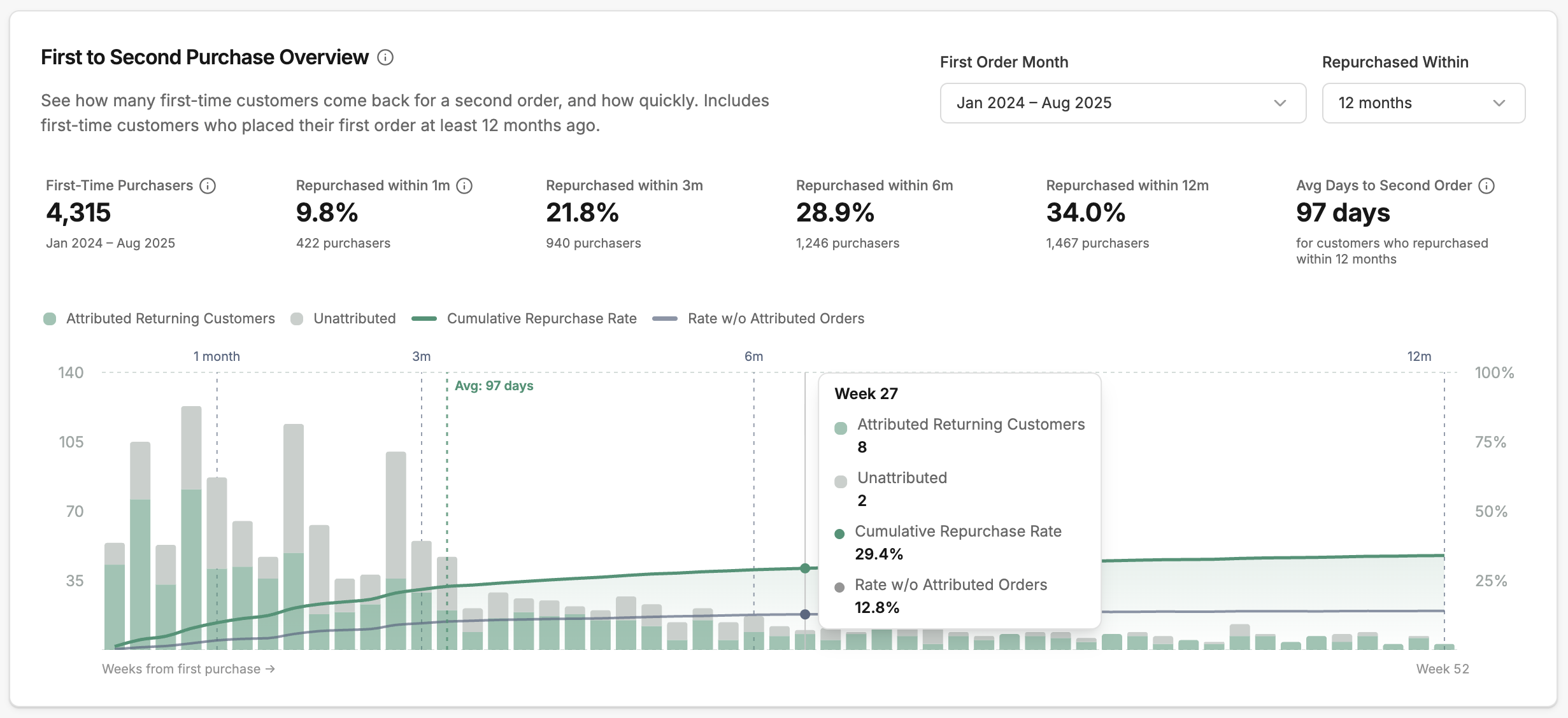
The card shows: how many first-time purchasers were eligible (had a first purchase old enough for the window), the share who placed a second order within your selected window, and the average days to second purchase among those who did.
In this example, 4,315 customers made their first purchase between January 2024 and August 2025. 422 (9.8%) placed a second order within one month, rising to 1,467 (34.0%) within 12 months. Among those who repurchased within 12 months, the average time to their second order was 97 days.
How to read it:
The bars show how many first-time purchasers made their second purchase on each week after the first order. Green represents attributed returning customers (repeat purchases driven by a campaign or flow); gray represents unattributed.
The green line ("Cumulative Repurchase Rate") shows the cumulative repeat rate: the share of all first-time purchasers who had placed a second order by that week.
The gray line ("Rate w/o Attributed Orders") removes repeat purchases Hiro can attribute to a tracked campaign or flow — it's your organic repeat baseline.
At Week 27, for example, 10 customers placed a second order—8 attributed and 2 unattributed. By that point, 29.4% of the original group had repurchased. The gray line, Rate w/o Attributed Orders, shows the repurchase rate when attributed orders are excluded; it was 12.8% at Week 27. The gap between the green and gray lines — 16.6% here — is the share of repeats driven by your marketing.
First to Second Purchase Rate by Start Month
Are newer groups of first-time customers coming back at the same rate as earlier ones?
How to read the table:
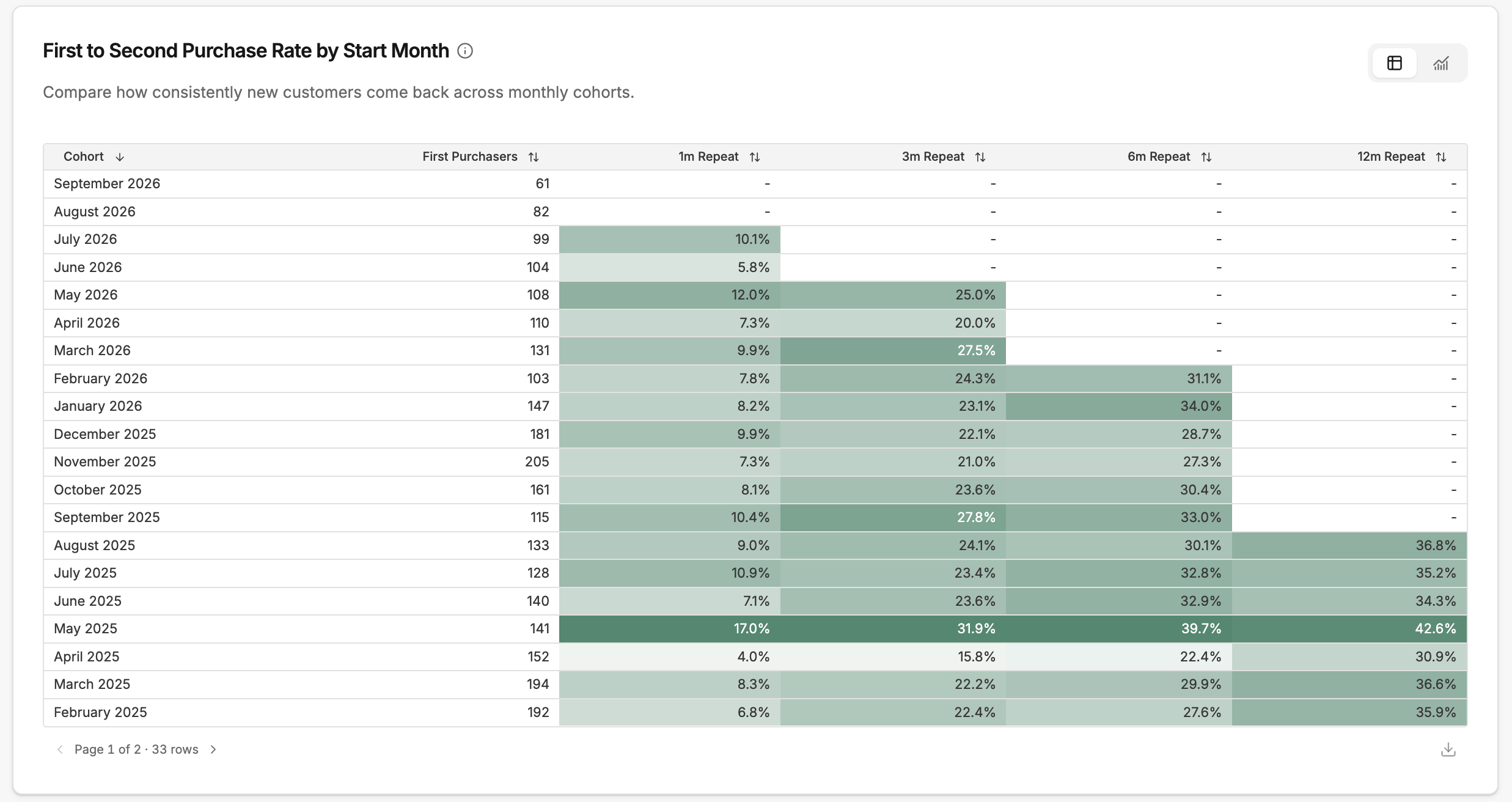
Each row is a monthly cohort of first-time purchasers: customers who placed their first order that month. "First-Time Purchasers" shows the size of that group.
The 1m / 3m / 6m / 12m columns show the percentage of that cohort who placed a second order within each window. The darker the cell, the higher the repeat rate.
For example, 194 customers made their first purchase in March 2025. 8.3% placed a second order within one month, 22.2% within three months, 29.9% within six months, and 36.6% within 12 months. Each longer window includes customers who repurchased in the shorter windows.
A dash means that cohort hasn’t completed the full window yet. July 2026 has a one-month result of 10.1%, but no three-month result. Compare cohorts using the same completed window rather than treating a missing result as zero.
Switch to the trend chart:
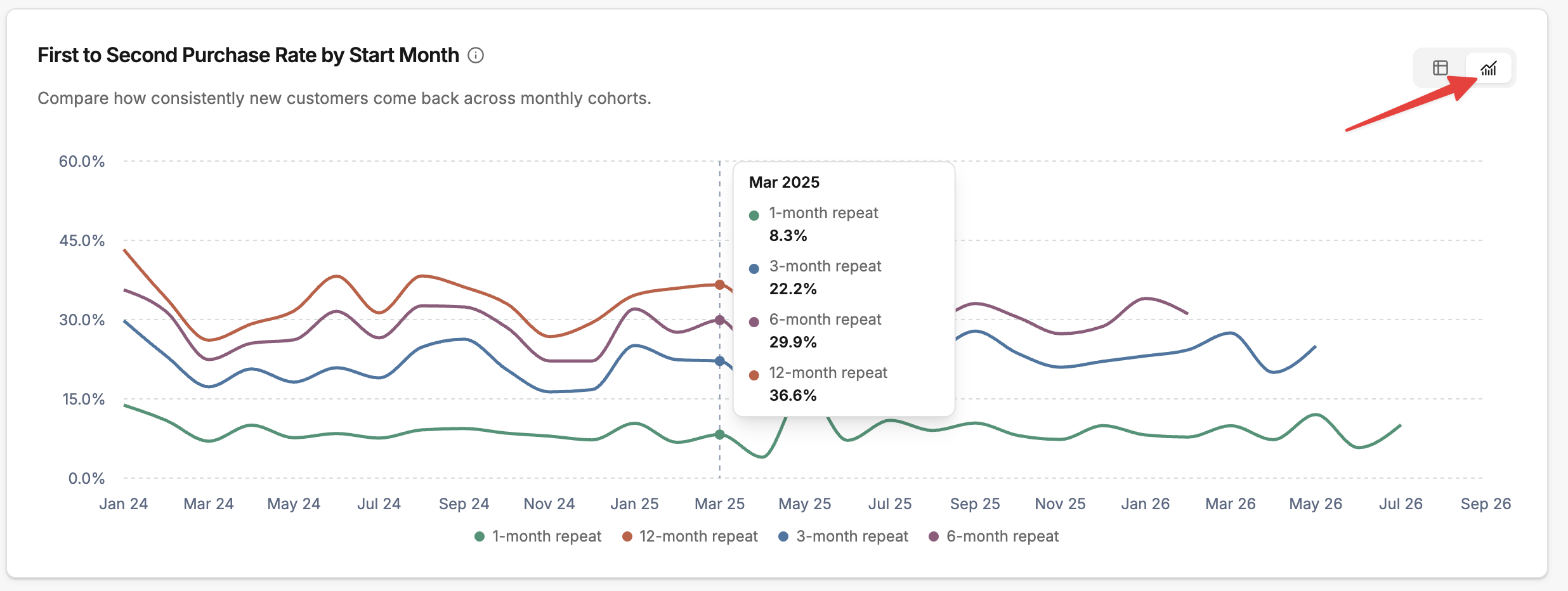
Select the chart icon to see how repeat rates compare across monthly first-purchase cohorts as lines.
Each point along the bottom is the month customers made their first purchase.
Each colored line is one window: 1, 3, 6, or 12 months.
Follow one line from left to right to see whether that window's repeat rate is going up or down for newer cohorts.
Look at one month from bottom line to top line to see how that cohort's repeat rate grows as it has more time.
The longer-window lines stop earlier because recent cohorts haven't had time to finish those windows.
Interpretation tips
Find out when customers come back, and time your messages to match
The gap between two columns tells you how many customers came back during that stretch of time. Here's the March 2025 cohort again:
Window | Repeat rate | Gap from previous | What it means |
|---|---|---|---|
1m | 8.3% | — | 8.3% came back in the first month |
3m | 22.2% | +13.9% | 13.9% came back in months 1–3 |
6m | 29.9% | +7.7% | 7.7% came back in months 3–6 |
12m | 36.6% | +6.7% | 6.7% came back in months 6–12 |
The biggest gap is between 1m and 3m, so most second orders for this cohort happen in months 1–3. That's when your post-purchase messages are most likely to reach customers who are ready to buy again. For more precise timing, check the Overview chart and look for the weeks with the tallest bars.
Here are three common patterns and what to test for each:
Biggest gap in months 1–3 (like the example above). This is a typical replenishment pattern: customers who are going to reorder usually do it within about three months. Test a replenishment reminder around days 25–45, before most of them have bought again, with a follow-up before day 90.
Biggest gap in months 3–6 (for example, 5% / 8% / 18% / 25%). Customers take longer to come back. This is common for pricier products, or products people think about before buying again. A day-30 reminder may be too early. Test a next-product recommendation around days 90–120.
High 1m rate that barely grows (for example, 14% / 16% / 17% / 18%). Customers who are going to come back do it fast, and very few return later. Put your effort into the first two weeks after purchase. A day-60 or day-90 reminder is unlikely to add much.
Check whether newer customers are coming back as often as earlier ones
Read down a single column in the table, or follow a single line in the trend chart. If more recent cohorts have higher rates in the same column, your newer first-time customers are coming back more often.
When a rate changes, think about what else changed that month: a big promotion, a new acquisition channel, a product launch, or a seasonal spike. Heavy-discount months often bring in customers who are less likely to buy again.
See how much of your repeat business is credited to your marketing
Use the gap between the green and gray lines on the Overview chart.
Wide gap: a large share of second orders is credited to your campaigns and flows.
Narrow gap: most customers came back without an attributed order. Check that your post-purchase flows are live and sending.
Changes over time: if the gap shrinks after you change a post-purchase flow, look into that flow first.
Common mistakes to avoid
Comparing different windows. A 12-month rate will always be higher than a 1-month rate. Compare cohorts using the same column.
Treating a dash as zero. A dash means the cohort is too new to have a result for that window.
Reading too much into one month. A single cohort can swing because of a promotion or a holiday. Look for a pattern across several months before drawing conclusions.
Ignoring cohort size. A month with more returning customers may just have started with more first-time customers. Check the First-Time Purchasers count alongside the rate. Small cohorts also swing more from month to month.
Comparing average days across windows. Longer windows include later second orders, which can raise the average. Compare cohorts using the same window.